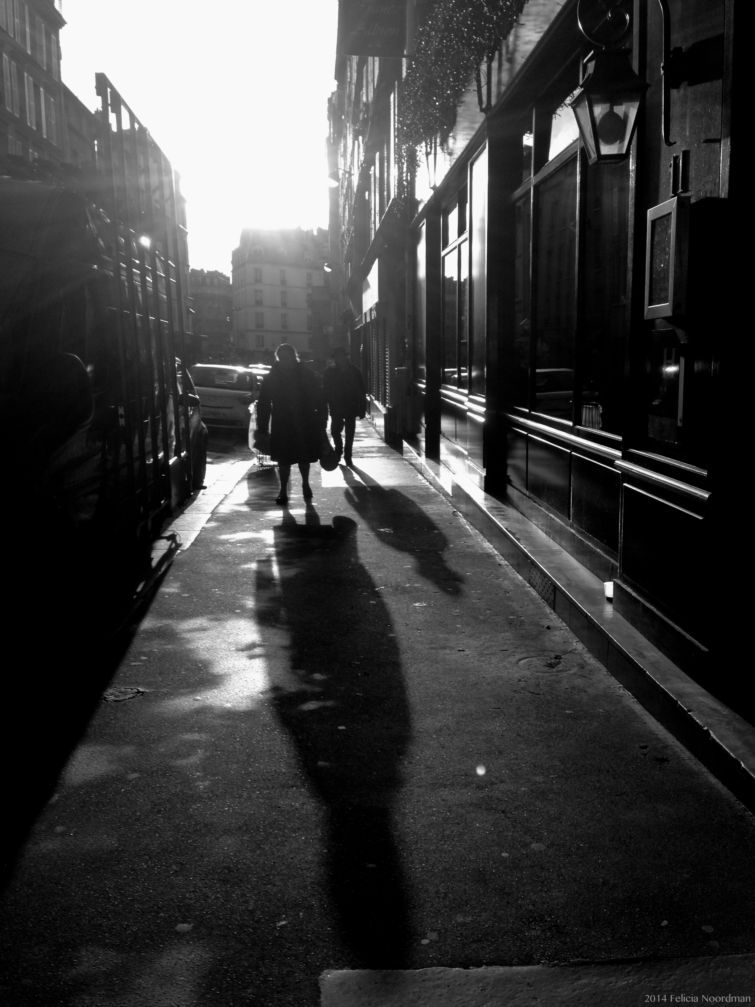
Thank you, Felecia. I feel very honored. It looks as good as I imagined. For my B/W work, I always shoot in colour and convert through post-prod after.
Assuming that you’re using Photoshop for your post-prod, I would recommend pushing a slight S-curve and the black and grey sliders in Selective Colour to make your blacks and greys slightly richer, and increase contrast. Just slightly so that those light rays aren’t washed out.
Are you going to try for a duotone as tuinkabouter1965 advised? I think that’s a good idea too. Convert it directly from the full colour, and then increase contrast as needed afterwards.